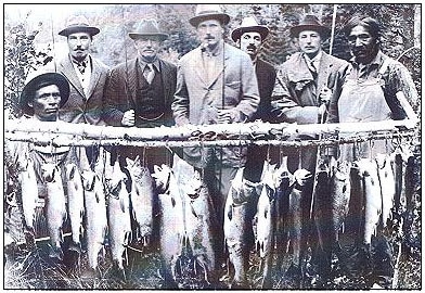
 You're not going to catch that many large brook trout, especially from a stream, today. You're not going to catch that many large brook trout, especially from a stream, today. My family is not the least bit outdoorsy. My mom came out to the field with me once before she died, but refused to step foot out of the car once I parked at the edge of the trail. At times my father has shown interest in my research. However, once I tell him I’m not trying to find new ways to grow larger, more tasty fish, he quickly loses interests. “What good is your research if the fish don’t get large enough to eat?” is a question that I hear all too often. Thanks, Dad. Little does he know, wrapped up in his disappointment is some interesting science that has lately been receiving a lot of attention. In addition to my dad (who doesn’t really fish, by the way), a common complaint among anglers is that fish aren’t getting as big as they used to. To add gas to the fire, technology makes it easy to find historic images of people proudly displaying their catch of 2+ foot long brook trout, surely caught with little more than a stick and line. It’s 2017. Managers should be able to get the fish are large as we want them, right? Unfortunately, it’s not that easy. Yes, things like climate change, habitat loss, and invasive species have caused declines in the maximum growth of many fish species. But, we can restore and protect habitats to help minimize some of those impacts. What we can’t do is reverse time, and the reason we can’t get large fish today has a lot to do with harvest regulations (or the lack thereof) hundreds of years ago. For most fish species, state and federal biologist have done a lot of math in order to determine the minimum harvestable size. This number is ultimately a compromise. You want the minimum size to be small enough that anglers have a good chance of being able to keep a fish, but you also want it large enough that the population remains robust and juveniles are not harvested before they can reproduce. So, you go fishing. You check minimum harvestable size, and when you catch a big fish you put in your cooler. When you catch a small fish, you return it to the water so it can grow larger, reproduce, and be ready for you next year. The logic seems sound, right? 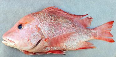 Some of the mostly closely monitored fish populations are in marine species, including snapper. Some of the mostly closely monitored fish populations are in marine species, including snapper. Not entirely. When you only harvest the biggest fish, you’re not only removing the oldest fish. You’re also removing the fish that are genetically programmed to grow faster and larger. Put another way, by keeping the big fish, you’re harvesting both the grandparents and the “tall kids” from the population. After many generations of anglers keeping only the big fish, the genes responsible for rapid growth are simply gone from the population. At that point, no amount of habitat restoration or food supplementation is going to end in larger fish. The population has lost the genetic capability of producing big fish.
This idea isn’t new to fisheries science, but has more prominence in marine ecosystems where biologists first recognized the need to protect both the smallest and the largest fish from harvest. Many marine fish species are regulated with slot limits, where only fish of a certain mid-range size are allowed to be harvested. Slot limits help protect both young juveniles, large pre-spawn females, but also the young fish with the “tall kid” genes. Slot limits can help preserve some of the genetic integrity of a population. However, scientists have lately realized that traditional harvesting regulations are probably doing more than just removing genes. For example, it’s been shown that angling selectively targets largemouth bass with bold personalities, that populations exposed to heavy angling have altered rates of gene expression (recall: gene expression can be important for many things, including allowing fish to survive stressful situations like high stream temperatures), and that reproduction declines with increases angling pressure. Consequently, biologists are now predicting that angling is indirectly reducing overall population health and future evolutionary potential. So, should you stop fishing? Absolutely not. But, it does highlight the need to rethink management goals and harvest regulations. We can’t just think about fish size, but need to start considering the more subtle effects that angling has on genetics, reproduction, and behavior.
0 Comments
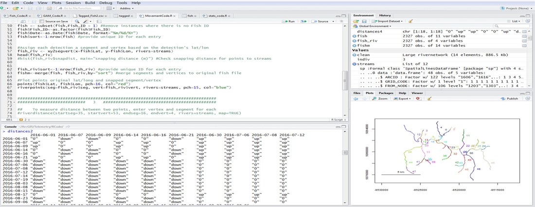
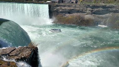 Strap a boom to the Maid of the Mist....it needs to go shocking! Strap a boom to the Maid of the Mist....it needs to go shocking! This past weekend I went on a camping trip to New York with a few others to celebrate the joint birthdays of myself and another friend. It was a great weekend of many camp fires, little technology, and general acceptance of camp funk from the camp fires and lack of technology. Brings me back to field seasons. Camping just outside Buffalo, we felt a little obligated to make the quick trip north to Niagara Falls. Walking around, I was asked several times whether fish could make the journey down the nearly 170-foot fall and survive. The answer is yes, absolutely! (Turtles can too, but this isn’t a turtle blog.) Generally speaking, as long as fish are falling in water (as opposed to falling through the air and hitting water at the bottom), they probability of surviving the fall is high. But, what about getting back up? It goes without saying that a trip down a fall as large as Niagara is a one-way journey. But, smaller falls can potentially be traversed by fish moving in both directions. This is especially true in salmonids (including trout), which are natural-born high jumpers and are able to leap several feet into the air if they can get a good “running” start. What makes a waterfall navigable by upstream migrants isn’t so cut and dry. A fall that is a straight drop is not going to be passable by even the most agile fish. But, smaller falls and falls made-up of a series of small step-downs can often be traversed. And, somewhat ironically, the ability of fish to navigate a waterfall increases with higher stream flows. Flooding increases water velocity in the center of the channel, which can give fish the extra boost of swimming speed needed to jump higher and further. High flows also cause streams to spill over onto the banks where it is normally dry, and fish seeking refuge in these temporary habitats often find new, easier routes, up waterfalls. So, how do we determine if a fall is navigable? Genetics! Specifically, we can look at the results from a program called STRUCTURE. STRUCTURE output can easily become difficult to understand. But, in short, you feed the genetic data from individual fish into the program, and it produces a diagram that shows you the most likely population assignment for each fish. You can then use the output to answer questions about where a fish was likely born, how connected populations are, and/or the extent an identified barrier (such as a waterfall) blocks fish movement. I find it best to think about STRUCTURE output with an example. STRUCTURE analyses can be performed on any organism, and the below example is from a paper on the plant, creeping fig. The authors’ sampled 17 populations, and STRUCTURE determined that there were only two genetically unique populations (as represented by the red and green colors). The number of sampled populations is much higher than the number of genetically distinct populations because there is a high degree of population connectivity and movement of individuals among populations prevents genetic isolation. 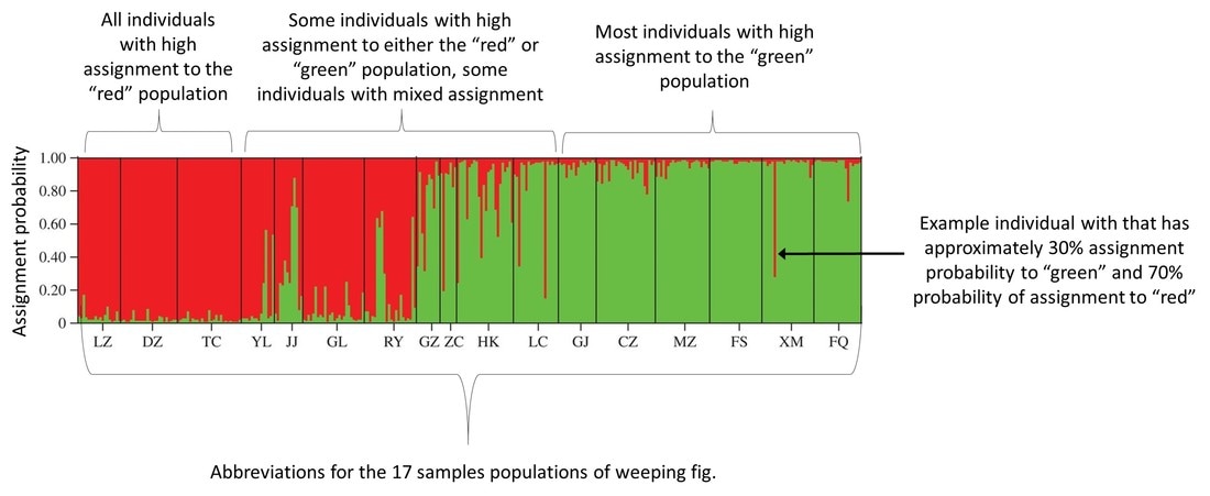 Example output from a STRUCTURE analysis on weeping fig by Liu et al. I've added annotations to help explain all the moving parts. If you look at the STRUCTURE diagram, you can see that there is a line for each individual, and each line is a stacked bar chart that is color-coded by the probability the individual assigns to each population. So, an individual with high assignment to the red population is represented by a solid red bar, and an individual with high assignment to the green population will be represented by a solid green bar. Bars that are of various degrees of both red and green represent individuals that have ancestors from both populations. For example, if an individual has a parent from each population, then they show up as 50% red and 50% green. Big picture, the more isolated a population, the higher the probability that individuals will be from a single genetic population. As a result, isolated populations show up as solid blocks of color in STRUCTURE. Populations that are more open have individuals that have lower assignment probabilities to many genetic populations, and they appear as blocks of mixed color in STRUCTURE. Now, let’s put this information to work using two examples from brook trout in Loyalsock Creek. The first is a fairly sizeable waterfall on Weed Creek. Normally when sampling for population genetics I don’t go above a known movement barrier. I know it is likely to separate a population, even if just a little, and so I would technically be sampling two populations instead of one. But, at this site, for reason that don’t matter, I decided to collect 40 fish downstream of the falls and ten from above. The STRUCTURE diagram looks like this. 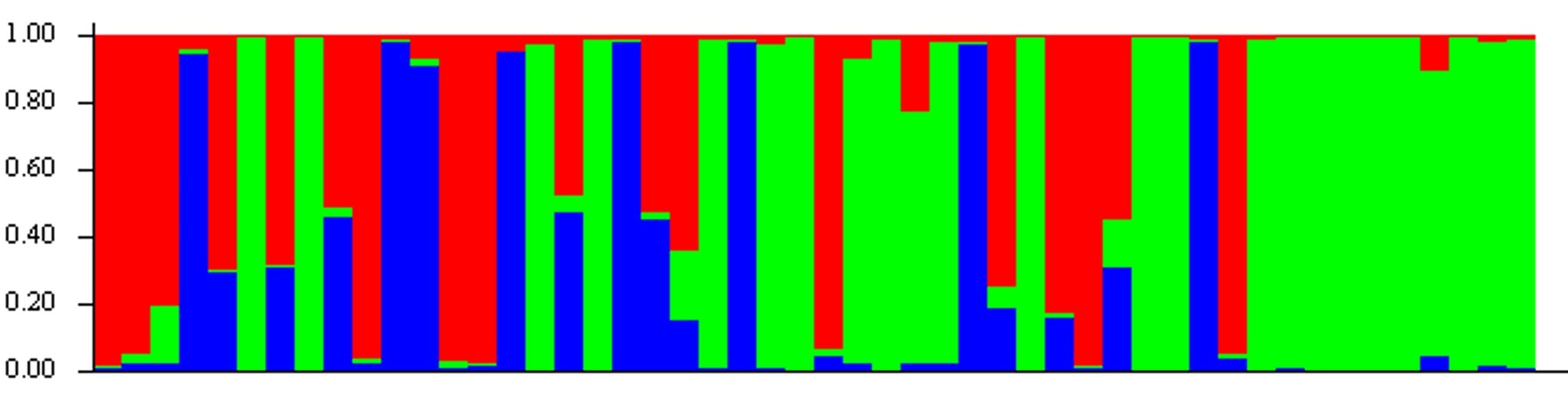 STRUCTURE output from a population of brook trout living downstream and upstream of a waterfall on Weed Creek.  The falls on Weed Creek. They don't look all too menacing, but apparently the fish don't like them. The falls on Weed Creek. They don't look all too menacing, but apparently the fish don't like them. Can you guess what’s going on? (Hint: there’s three genetic populations in this diagram, and the fish caught upstream of the waterfall are on the right). If you guessed that fish weren’t moving upstream of this fall, then you’d be correct. The solid block of green on the right represents fish upstream of the fall, and they are all assigning with high probability to the “green” population. Downstream of the fall, things are a little more interesting and a lot more confusing. We see several fish with high assignment to the “green” population, which probably represents fish that recently dropped down the falls. As you can see, there’s quite a few fish that make the journey down the falls and survive. There’s also several fish that are represented as mostly red or mostly blue. One of those colors probably represents the genetics of the resident fish of Weed Creek who living downstream of the falls. The other is probably fish that are moving in from another tributary. Which color is which is uncertain with the data at hand. Lastly, we see fish that are combination of any two colors, or, in some cases, all three colors. This represents individuals that were spawned from some combination of fish dropping downstream, moving from outside of Weed Creek, and/or fish living downstream of the falls in Weed Creek. This is what it looks like to have a genetically diverse population! Now, let’s look at another example for comparison. This time, I’ve chosen two different streams, separated by no known barriers, and quite literally a stone’s throw away from one another. Before scrolling down, take a second to think about what you might expect the STRUCTURE diagram to look like. 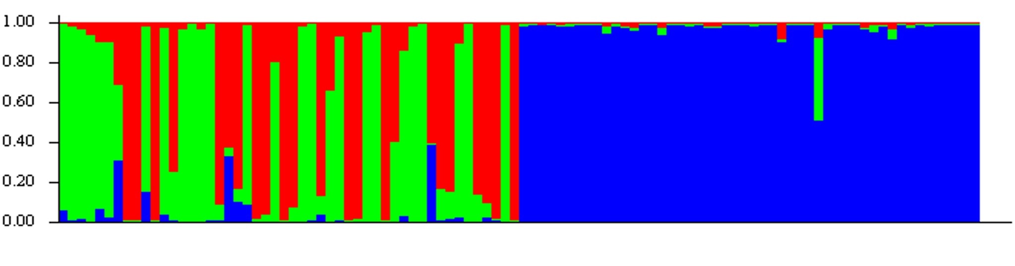 Not what you were expecting, huh? One stream is almost entirely genetically distinct and shows up as a nearly solid blue box. The other stream has a little more diversity, with two genetic populations nearly equally represented by green and red. But, more strikingly, we see almost no fish from the other site, the “blue” site, finding their way into this stream.
What’s going on here? I’m not sure. But, what this genetics data highlights is that movement barriers aren’t always so obvious. Sure, waterfalls, bridge crossings, and dry channels decrease movement. But, sometimes we can’t always see the barrier, and it may not be a physical barrier but could be driven by some sort of behavior. In the examples here, there was more movement downstream of a fairly large waterfall than there was in an open channel. But, now that we’ve uncovered this hidden barrier, we can start looking a little more closely and potentially find a way to reconnect these two populations. Exactly one year ago, fueled by coffee and angst, I tagged my first telemetry brook trout and started what would be an 11-month study on movement and gene expression of four brook trout populations. I had no idea what I was getting myself into (for starters, it was supposed to only last six months). And, as I continue to analyze the data, I’m not entirely sure what I got myself into. But, what I do know is that one year later, a combination of good fortune and effort led to some pretty cool data. So, what did I learn in the last year?
 In case you're wondering, 30 minutes on medium heat can dry out the inside of a receiver box, but I would not recommend.
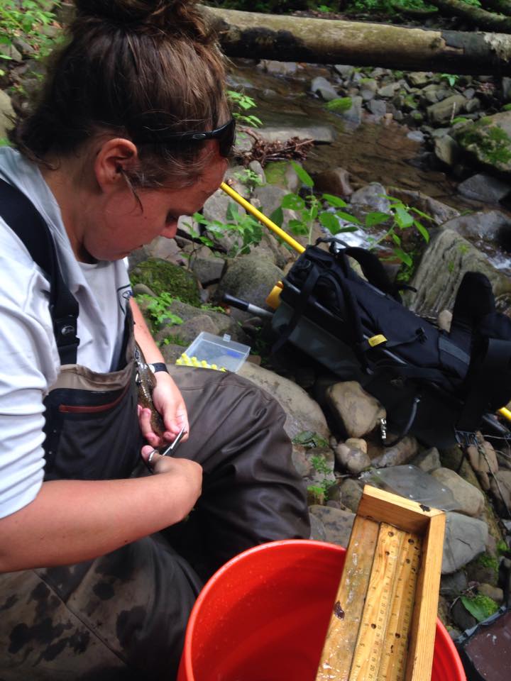
 A little snapshot of what it looks like to measure fish movement distances.
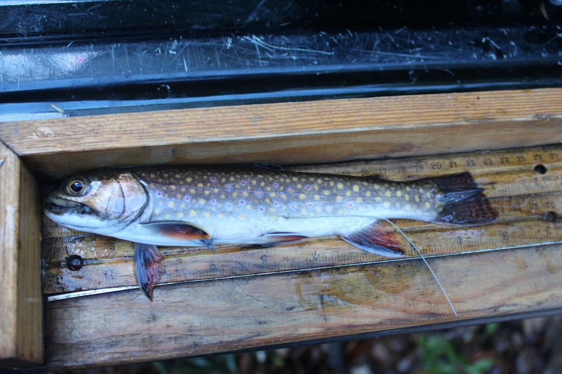 The little fished that proved metapopulation dynamics in Loyalsock Creek.
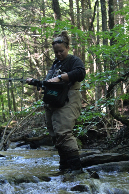
 With a simple clip of the fin, we can get a whole lot of data on genetic diversity and population connectivity. 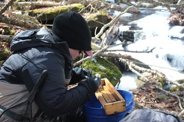 To monitor gene expression, we not only have to sample fish in hot temperatures, but also cold. That's okay..eventually you don't feel your fingers, anyway! To monitor gene expression, we not only have to sample fish in hot temperatures, but also cold. That's okay..eventually you don't feel your fingers, anyway!
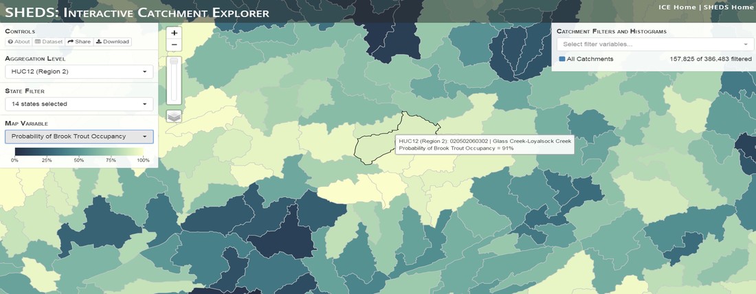
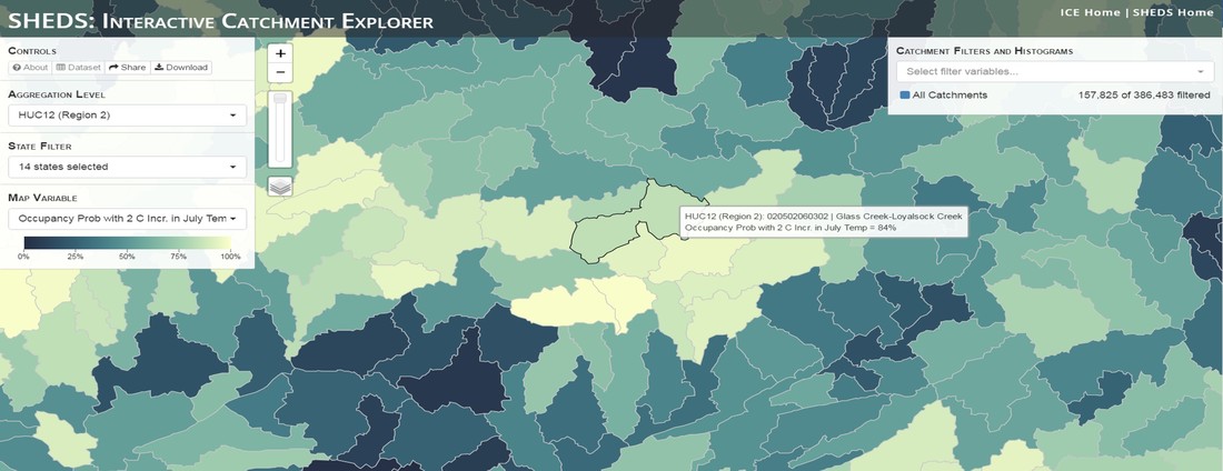
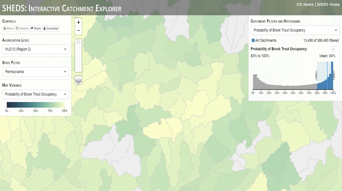
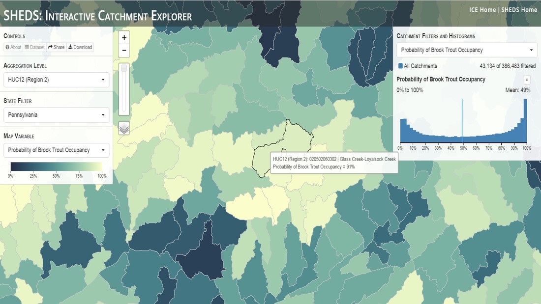
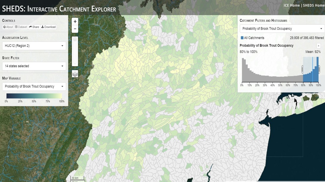
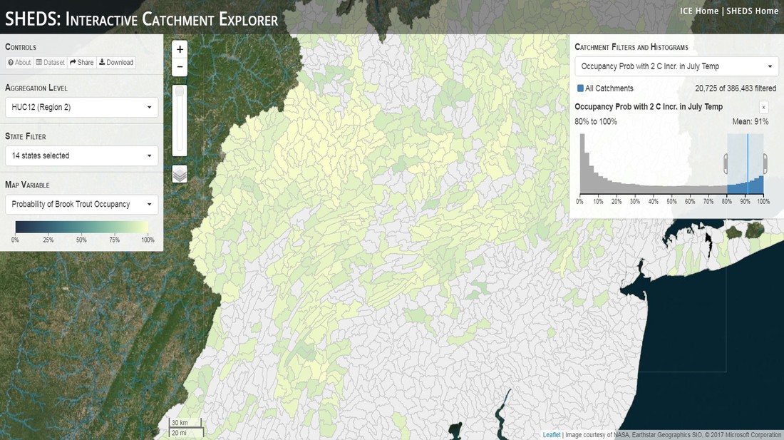
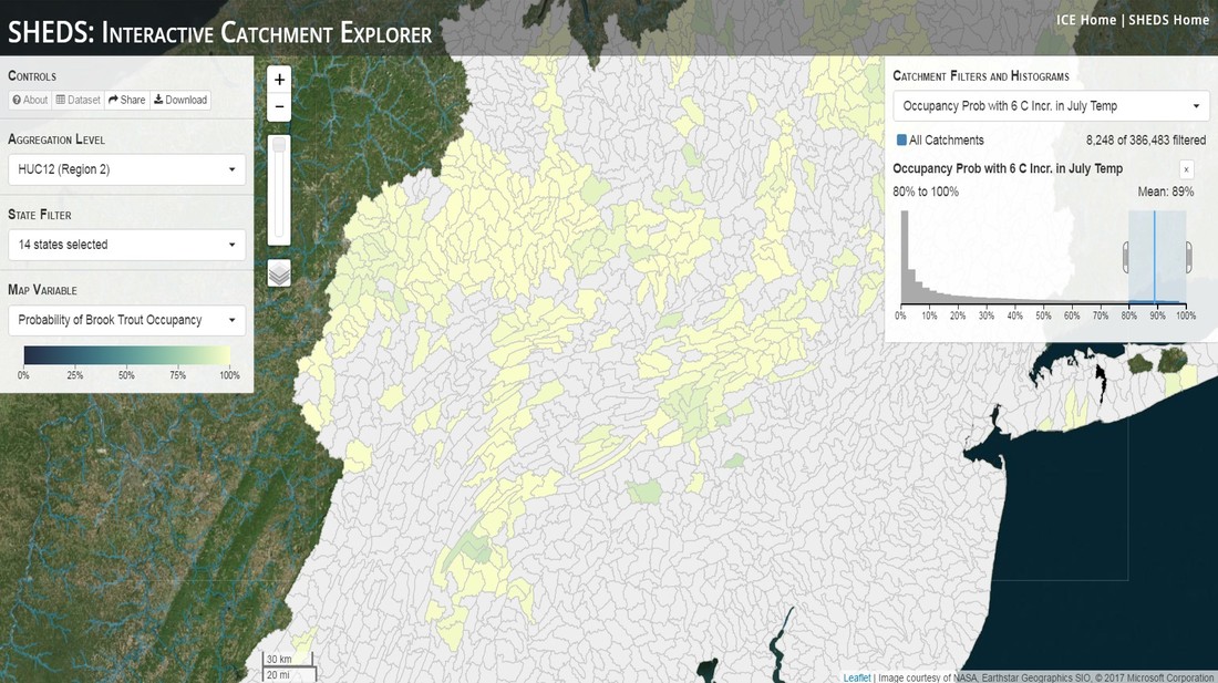
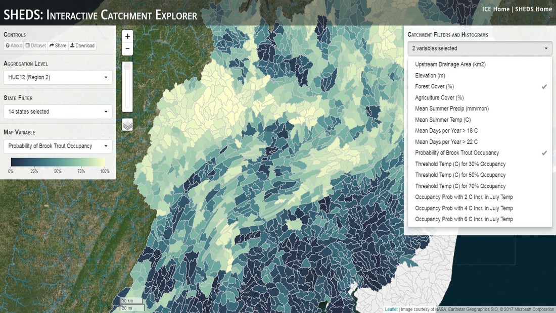
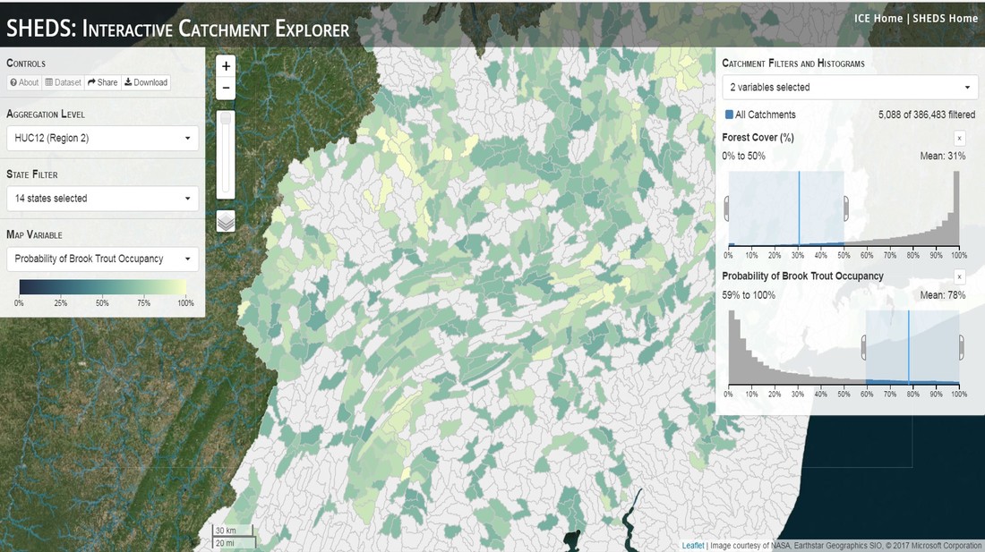
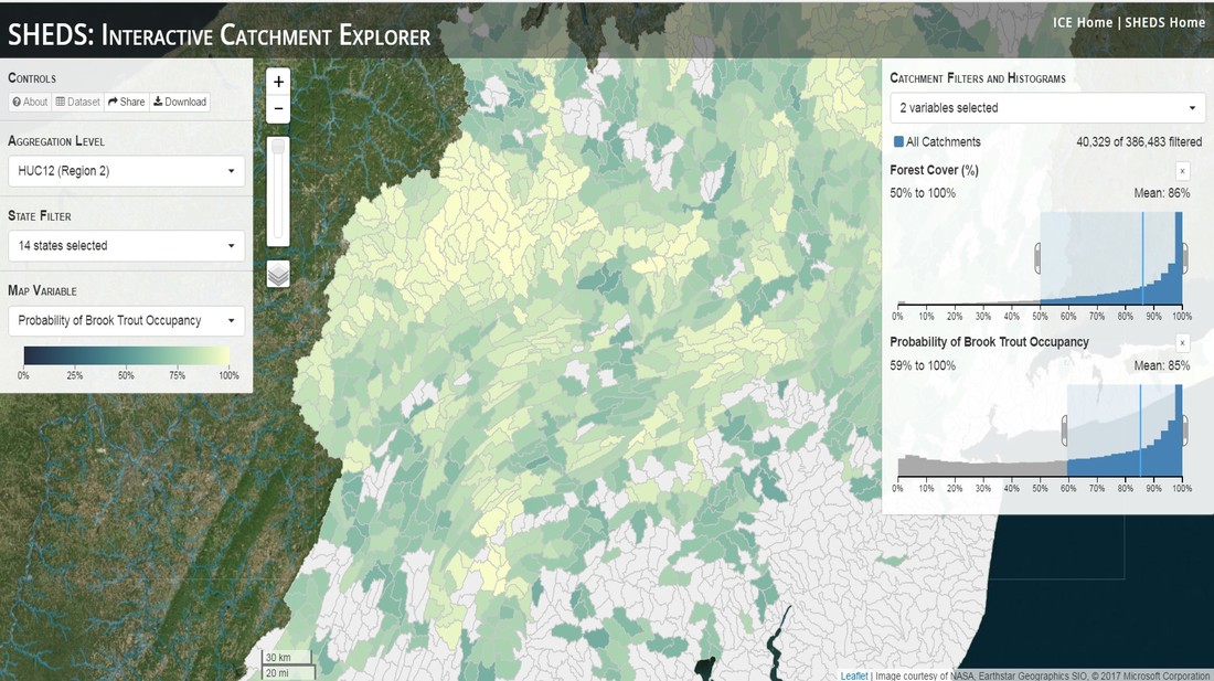
Having spent much of the last year working outside, I have to admit that it feels a little weird to not be frantically packing and preparing for field work right now. But, as much as I would rather be out in the streams, it’s time to hang up my waders and get to analysis. After all, I need to graduate eventually! Ever have one of those weeks where you’re distracted by a million other things and get nothing done. Yea? Well, that was mostly me this week. Thankfully, I’m landing into the weekend with loose ends mostly tied back up and ready to actually work through this cold, rainy, graduation weekend (seriously…it could snow Sunday?). With little appreciable progress on my end this week, I’m turning to some outside sources to showcase cool science. Lately, it’ been tough to turn a blind eye to the fact that funding for many government programs that support scientific research, and potentially my future career, is getting overhauled, sometimes completely nixed. Recent international marches for science and climate have brought light to the fact that many are opposed to these changes. But, have you stopped to hear out the science critics? I can’t say I agree, or even know, all of their views, but some of their arguments hold a lot of weight. For example, one of the biggest oppositions I’ve seen to government-funded science is that the average person feels “left out” of what is being said. I hear you. I feel left out of science, and I’m a scientist. But, as I’ve campaigned before, it doesn’t have to be that way. And, there are some great resources out there to showcase some of the efforts of federal scientists. Case in point- if you’re interested in brook trout, stream temperature rise, climate change, or geography, go ahead and click on the website for the Spatial Hydro-Ecological Decisions System, or SHEDS http://ice.ecosheds.org/sheds/. This website was produced by a team of scientists, many employed through the United States Geological Survey, a bureau of the Department of the Interior, to produce a visual tool to display hard to access data and the results of really complex models. If you click of the website, you’re brought to an interface that shows a map from Maine to Virginia. Though native brook trout extend as far south as Georgia, data on populations south of Virginia are more sparse and not easily incorporated into this larger dataset. 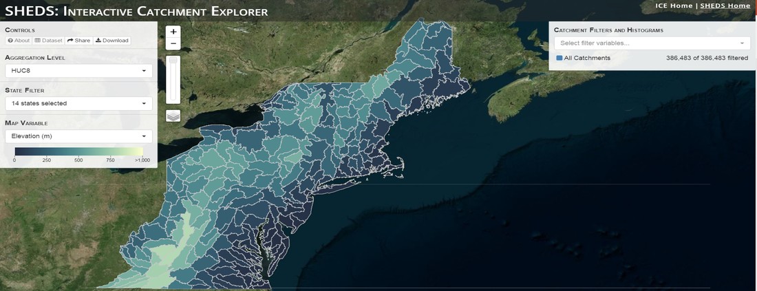 The landing page when you first open the SHEDS website. Don't worry if your's looks a little different than mine, it seems to never load the same way twice. On the left is a series of drop-down menus where you can customize which data are displayed. It starts by selecting a spatial extent based on HUC watershed. For those unfamiliar with HUCs (short for Hydrologic Unit Code), just know that the larger the HUC, the smaller the watershed. So, for example, a HUC4 watershed is much larger than a HUC8, and HUC8 larger than HUC12. After you select a HUC size, the watershed outlines will appear on the map and the next drop-down menu is automatically populated to show the states that your selection covers. You can also select the state(s) you’re interested in directly from this second menu. 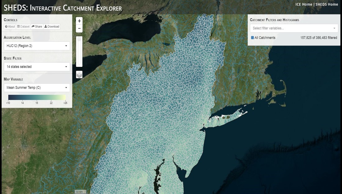 You can see that going from HUC8 to HUC12 really decreases the size of the watershed. Also note that HUC12s are so small that all the data can't load at once, so you'll have to define a specific region. Now, after you find the watershed of most interest to you, the fun really starts. The “map variable” section has TONS of information to characterize the current and future habitat in and watershed and occupancy probability for brook trout. With a click of the mouse, you can have information such as average elevation, percent of forested land in the watershed, and average summer temperature. These are all variables that biologists have determined are the best predictors for brook trout occupancy, which you can also plot on the map. Simply select which variable you’re interested in, and hover over your watershed to see the value appear. 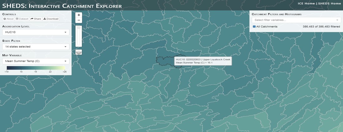 Zooming in and hovering over one of the HUC10s for Loyalsock Creek, you can see that the average summer temperature in 16.1C. My data from this summer would agree! But, what about the future? If you look at the last three variables in that drop down list, you see occupancy probabilities with 2, 4, and 6°C increases in July temperature. Clicking on these values will show results of models that predict brook trout occupancy based on these three projected levels of stream temperature rise. For example, brook trout occupancy probability in Loyalsock Creek is currently 91%. But, it decreases to 84% and 58% with 2°C and 6°C increase in stream temperature, respectively. Change in brook trout occupancy probability from present (left), 2C increase (middle), and 6C increase (right) in temperature. Click on each picture to view the full model output. The fun doesn’t stop there. So far, we’ve been characterizing the habitat and occupancy for specific watersheds. What if you flipped that line of thought, and looked for watersheds that met specific habitat and occupancy values? For examples, what if you wanted to see all watersheds that currently have a >90% probability of brook trout occupancy? Easy! Simply go to the drop down menu on the right and select ‘probability of brook trout occupancy.’ A histogram of all the data will appear. Take the little plus sign cursor, and click on the blue line going through average value, and drag it to 100%. You’ll notice a box appear to highlight watersheds within the desired occupancy probability. By moving the upper and lower limit of that box, you can highlight watersheds with desired occupancy probabilities. By using the drop down tools in the "Catchment Filters and Histograms" menu, you can start narrowing down watersheds that meet certain criteria. Play around with the other variables. One of my favorite comparisons is to see how stream temperature rise might affect brook trout occupancy probability. It’s particularly interesting to zoom out at larger scales, and see larger trends in projected declines. Look how many watersheds are expected to lose quality brook trout habitat. Watersheds with >80% probability of brook trout occupancy today (left), with 2C (middle), and 6C (right) increase in stream temperature. See how the number of watersheds declines with temperature? Click on the pictures for a closer look at model results. Finally, what if wanted to play around with two variables? For example, we know that brook trout like forested watersheds, and you can visualize that relationship by clicking on both “% forest cover’ and ‘probability of brook trout occupancy.’ Again, play around with the sliding rules and see how forest cover affects occupancy. You can click on multiple attributes in the "Catchment Filters and Historgrams" menu (as seen on the right). From there, you can slide the histograms around to see, for example, the watersheds that have a >60% probability of brook trout occupancy when there is <50% (middle) and >50% (right) forest cover in a watershed. As you can see, the number of watersheds with higher occupancy probabilities increases considerably with more forest cover. This was a really quick rundown of an amazing tool. More information on how to use the web interface can be found at http://ice.ecosheds.org/, and details about some of the models used to generate the data can be found at here and here. 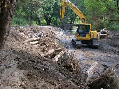 Stream restoration can take many faces- everything from riparian tree plantings to more significant channel redesign and reconstruction. Photo from seagrant.psu.edu. Stream restoration can take many faces- everything from riparian tree plantings to more significant channel redesign and reconstruction. Photo from seagrant.psu.edu. For states fortunate enough to have cold water flowing through their hydrologic veins, native trout conservation tops the list of management goals for many state and federal fisheries biologists. Often times, we take a “if we build it, they will come (and stay)” approach to conservation. In other words, more habitat equals more fish. Every year, state and federal agencies, non-profit organizations, and local citizen groups spend millions of dollars on stream restoration and habitat additions. This includes everything from riparian plantings to decrease water temperature and sediment transport, instream structures to create pools and slow down stream flow, and even reconstruction of the stream channel. Does it work? When done properly, yes. Stream restoration activities are great at increasing (sometimes for decades) local trout abundance and survival. But, habitat restoration does not discriminate between species. Good faith efforts to increase one trout species (like native brook trout on the east coast), will also increase populations of nonnative trout- in this case brown and rainbow trout. If fish shared habitat peacefully, this wouldn’t be a problem. But, nothing in nature is ever that easy. Trout species share habitat like two toddlers in a toy box. Competitions for the best spawning and feeding spots are common, and champion fighters get a major advantage- their first pick of home territories; places that have the most food, the best hiding spots from predators, and not too much flow (otherwise the fish has to use too much energy to swim around). These spots are generally won by nonnative species, who’s faster growth rates and tolerance to warmer temperatures make them gold medal fighters. Worse yet, native species don’t just lose the fight, they are usually kicked entirely out of the playground. 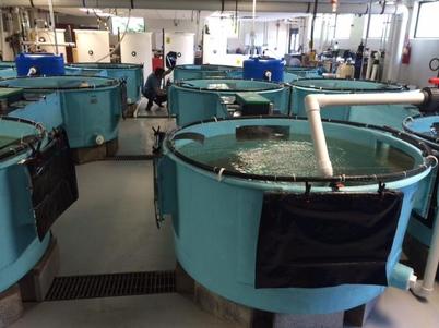 The experimental stream lab at the USGS Leetown Science Center allows for us to do very controlled experiments of habitat use and species interactions. Photo from wvpublic.org. The experimental stream lab at the USGS Leetown Science Center allows for us to do very controlled experiments of habitat use and species interactions. Photo from wvpublic.org. Competition between brook and brown trout is not a new topic. We already know brown trout typically outcompete brook trout because brook trout grow slower and shift their habitat use when brown trout are present. However, figuring out exactly how the two species interact and divvy up space is more of a challenge. Streams are very complex environments with limited controllability. It’s hard to figure out how fish compete for small-scale habitat features (like the features we would typically add to a stream during restoration) when habitat quality changes so fast. We can develop very complex maps that accurately predict the best place in the stream for a fish, and then observe fish interact for those spots. But, one storm can completely change habitat availability and desirability. Likewise, one fish moving in to, or out of, a pool can shake up the competitive dynamics and turn winners into losers, and vice versa. It’s very difficult to make very small scale observations in natural systems. Enter the experimental stream lab at the USGS Leetown Science Center in West Virginia. Than Hitt recently lead a study that looks at how brook and brown trout compete for different habitat requirements with rising stream temperature. The setup was fairly straightforward- four streams, each with three pools and two riffles. Stream temperature was gradually increased form 57°F to 73°F, all while the last pool was held at a constant 57°F to mimic cold water upwelling areas common in mountain streams. There was also a feeder that continually released food, but it was located at the top of the stream, far from the cold water upwelling. Two streams were stocked with 10 brook trout, and two streams were stocked with 5 brook and 5 brown trout. 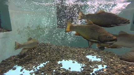 This study wasn't conducted on small fish, either. All fish were size matched, and about the size of the fish in this photo. This study wasn't conducted on small fish, either. All fish were size matched, and about the size of the fish in this photo. The idea behind this design was to supply two areas of required habitat – food and cold water- and see how fish compete for each as temperature increased. When temperatures were cooler, food should be the most desirable resource, and competitions near the feeder should be fierce. But, as temperatures increased, competitions should shift away from food and towards spots in cold water. Brown trout added a layer of complexity, and the expectation was that brook trout should be the best fighters at cold temperatures and win access to food, but at warmer temperatures they would start losing competitions to brown trout.
The result? As expected, the desirability of the food patch declined with temperature. In the brook trout-only stream, fish slowly shifted from spending their time near the food, to spending the majority of their time in the cold water. Not a surprise. Fish can survive several days without food, but they can only survive a few hours in stressful temperatures. But, when brown trout were present, brook trout couldn’t get near the food. Not at cold temperatures, and not at warm temperatures. Brown trout excluded brook trout from habitat patches were food was most abundant and, overall, brown trout influenced brook trout habitat selection more than temperature. What this study shows us is that just because habitat is available, doesn’t mean that your target species is able to use it. Instead, removing competing species may do more to increase habitat availability than physically increasing the amount of habitat in a stream. In fact, because nonnative species can exclude native species from desirable habitats, increasing habitat availability could increase nonnative species abundance without doing much to increase population size of native species. In this study, brook trout were excluded from foraging locations and restricted to habitat that was still thermally suitable. What if they had been kicked out of cold water and into warm water? In this case, brown trout would be pushing brook trout into lethal habitats. This is likely to be the reality moving forward with stream temperature rise. There are a growing number of streams that get seasonally too warm for trout, yet they still maintain populations because trout move into areas of cold water refuge during temperature spikes. For fish that are thermally stressed, these refugia are their last lifeline, and fish are willing to spend their last bit of energy vying for even a few minutes in cold water. Inevitably, competition for such a limiting resource reduces populations sizes as not all fish can occupy the refuge and many are forced into lethal habitats. But, when two species start competing, it will likely result in extirpation of the less successful competitor. And, if history repeats itself, we already know that brook trout are likely to lose. *Note: Content in this post is my own and may not reflect the opinion of the manuscript's authors or the agencies they represent. I encourage you to read the manuscript so you can contribute to the discussion.  Native to the west coast, managers started stocking rainbow trout out east in the last 1800s to supplement declining brook trout populations. Only, they didn't take off everywhere they had hoped. Native to the west coast, managers started stocking rainbow trout out east in the last 1800s to supplement declining brook trout populations. Only, they didn't take off everywhere they had hoped. Pennsylvania plans to stock over 4.5 million adult trout this year, of which about half will be rainbow trout. Yet, despite such high stocking densities, we don’t see many stocked rainbow trout establishing breeding populations. How could this be? For starters, stocked fish mortality can be upwards of 99%. And, dead fish don’t reproduce (science at its finest!). But, I won’t focus on that today. For a more interesting roadblock, we have to think a little harder about stream ecology and the conditions rainbow trout evolved under. Opposite to brook trout, rainbow trout spawn in early spring from about January-May. In rainbow trout’s native range along the Pacific coast, snowmelt and heavy rains cause consistently high flows during early spring. Predictably high spring stream flows are critical for rainbow trout, as high flows scour the streambed, removing silt, gravel, and debris. Effectively, high flows are the street cleaners that come in after Mardi Gras and prepare the streambed for rainbow trout to spawn. After spawning, predictable summer low flows protect rainbow trout eggs from washing down stream until they can hatch a few months later. 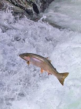 High stream flows are a necessary habitat feature for rainbow trout. High stream flows are a necessary habitat feature for rainbow trout. In short, rainbow trout like predictability. Predictably high flows in winter, and predictably low flows in spring and summer.
Now, let’s think about Pennsylvania. Yes, early spring flows are generally higher than summer flows. But, they are far from predictable. One year there might be deep snowpack, the next year there might be no snow at all. Plus, summer flows can be equal to, if not exceed, winter flows. The combination all but assures near 100% mortality for rainbow trout eggs laid in the northeastern United States. Of course, there are exceptions to this statement, and the northeast does have naturally reproducing rainbow trout populations. However, it usually takes some assistance, with most occurring downstream of impoundments (which make flows more predictable) or selectively bred to reproduce in fall. But, the story doesn’t end there. In the southeastern United States, at the southern edge of the brook trout’s native range, climate change is resulting in more frequent winter rain events and summer drought-like conditions. In short, the more predictable stream flows that rainbow trout need for reproduction. Down south, rainbow trout are not only reproducing, but are starting to outnumber brook, and even brown trout. This is, in part, due to rainbow trout’s higher thermal tolerance, but also because high winter flows decrease brook and brown trout egg survival. It’s not uncommon for entire year classes of brown and brook trout to fail because of high winter flows killing eggs. Thinking ahead, with changing climates, could rainbow trout eventually becomes more successful at establishing in the northeast United States? Possibly. And, when if/when they do, we’ll see further declines to not only brook, but also brown, trout populations. Low detection probabilities. After our failed attempts to collect fish during the March deep freeze, I assumed we could hang up out waders until early May. Our dataset that looks at how brook trout express stress proteins in response to rising stream temperatures was looking great, but it also was missing data for fish collected around 50°F. So, I thought, I just need to hit the waters around early May when I knew temperatures would be in that range. But, at the last minute I was able to plot our data from May 2016, back when we started this project and stream temperatures were around 50°F. Surprisingly, that is when stress protein production was highest. Now the question becomes- was that truly the peak in stress protein production, or do fish start producing the proteins even sooner in the year? The only way to know is to collect data at cooler temperatures. No problem, I thought. We’ll move sampling up a few weeks. Plenty of time. But, a quick look at the weather and I realized that Pennsylvania was going from snowing to summer-like conditions practically overnight. Because stream temperatures respond quickly to changes in air temperature, I knew they would be rising quickly. So, it was all systems a go- sampling needed to happen immediately. 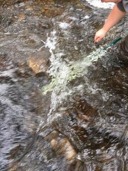 Signs on high flows. Our staff gauges, which are hammered 8 inches into the stream bed on a fence post, were completely flattened this week. Signs on high flows. Our staff gauges, which are hammered 8 inches into the stream bed on a fence post, were completely flattened this week. Thankfully, Danielle, a technician in our lab working on flathead catfish, was itching to get outside and was ready for the journey. We hit the road at 6am Monday, and pulled 12-15 hours on the creek for most of the week. With recent heavy rains and snowmelt, stream flows were roaring. Pools were too deep to wade through, runs were rapids, and very few fish were in the shallow edges that are surely only temporary additions to the high flow channels. At one point we were only catching about one fish an hour. With Danielle running equipment up and down the banks and me electrofishing through the rapids, those were easily some of the most exhausting field days I’ve ever had. But, we got the data…18-20 fish per site. Not exactly what we wanted, but it will be enough. Now, we wait in anticipation to get the gene expression data back. Knowing when fish start expressing these stress proteins is turning out to be a more interesting question than I originally thought. From the data we already have, we know that expression is basically zero during peak summer temperatures. This seems a little suspicious, as we would expect stress protein expression to increase with increasing temperatures (more stress=more stress proteins). But, in reality, it seems that fish express stress proteins in highest abundance at the first sign of increased temperatures. 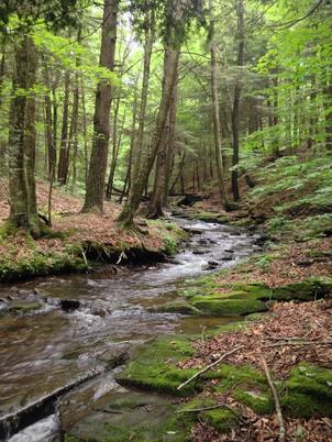 We'll be switching all of our sampling to Rock Run which, at normal stream flows, is a gorgeous site with lots of nice fish. Looking forward to a change of scenery. We'll be switching all of our sampling to Rock Run which, at normal stream flows, is a gorgeous site with lots of nice fish. Looking forward to a change of scenery. So what? Well, if stream temperatures rise too soon in spring, fish start expressing stress proteins earlier. But, there is a finite amount of proteins that can be expressed and, by summer peak temperatures, fish have essentially run out of stress proteins. To put it another way, the fish we study are wired to produce stress proteins that were probably more adequate for past climates where stream temperatures rose later in the year and didn’t get as hot. Today, with higher maximum temperatures and longer duration of warm temperatures, trout may not have enough stress proteins to adequately protect their cells.
As with everything, the story is much more complicated than that. Stress proteins stick around long after expression, so expression is not a complete indicator of presence. And, we are studying only one of many stress proteins. But, we do know there seems to be a finite amount of stress proteins that a fish can express before the machinery gets turned off; a conclusion that is a bit troubling when considering the impacts of climate change on brook trout. With this round of sampling, we also bid farewell to my three telemetry sites. I’ve spent the better half of the last year walking around those sites, and to have left there for the very last time was a bit surreal. I’ll be back Loyalsock, but I’m definitely transitioning out of the field and into data analysis. The beginning of the end? Maybe. 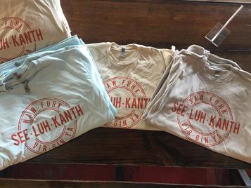 Proper pronunciation of both coelacanth and Norfolk. I need this shirt. Image from http://www.coelacanth.com Proper pronunciation of both coelacanth and Norfolk. I need this shirt. Image from http://www.coelacanth.com A few months ago I explored the story behind the names for two fish-themed beers- one from Bell’s Brewery (Two Hearted Ale) and another from Hardywood Park Craft Brewery (The Great Return). This morning I saw the new t-shirt design for another fish-centric brewery, Coelacanth Brewery and thought “hey, maybe I should bring back the mini-series for this week’s blog.” And then I realized that today is National Beer Day. Okay world, I’m listening. The slogan for Coelacanth Brewery is “ugly fish, beautiful beer,” and boy did they hit the nail on the head with that one. Because this is a fish blog, I’ll focus on the first half of that slogan (but I assure you, the second half is also no lie). Located in Norfolk, Virginia, Coelacanth Brewery (which you can see the phonetic spelling of on their t-shirt design, along with the proper Virginian pronunciation of Norfolk) is named after one of the most ancient fish species still alive. Long thought extinct, the first living coelacanth was discovered in 1938 off the coast of Africa. The African coelacanth enjoyed it’s status as the only living species for nearly 60 years until it was joined by another species of coelacanth found off the coast of Indonesia (ironically this species was first discovered at a market, but it was caught alive a year later). 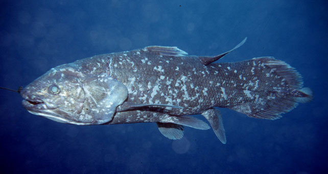 Can the coelacanth get any uglier? I (and now a brewery!) think not. Take a special look at the fins and mouth and try to compare them to what you would normally see in a fish. Image courtesy of http://vertebrates.si.edu/. Coelacanths are the fisheries equivalent to a living dinosaur, and critical pieces of evolutionary history. Though later genomic studies debunked this myth, it was once thought that coelacanths were the ancestors to modern-day tetrapods (four-limbed vertebrates including amphibians, reptiles and, that’s right, even humans). It was later determined that lungfish, a close relative to coelacanths, were the first to walk out of water. But, looking at a coelacanth’s fins it is easy to see why scientists were mistaken. Those weird looking, oddly placed appendages are not the ray fins that we typically find on fish. Rather, coelacanth fins are fleshy and lobed, much like we might associate with a salamander or frog. Moreover, they move their fins in an alternating pattern similar to how a dog moves their legs when trotting. This unique fin structure is what classifies coelacanths into the class Sarcopterygii, of which most species belonging to that class are now extinct. But, the weirdness of the coelacanth doesn’t end with its fins. While most fish lay eggs, coelacanths actually give birth to live young, known as ‘pups.’ These pups are able to immediately start fending from themselves and feed with the help of an electrosensory organ on their nose. This organ allows coelacanths to detect changes in electrical signals around them, which can be used to detect prey and even navigate around their environment. Coelacanths also enjoy the benefits of a hinged jaw which, much like a snake, can be opened far wider than their heads so they can consume a very large meal at once.  In addition to the long lifespan, coelacanths don't reproduce until about 20 years old and only then produce less than 30 pups at a time. The long life cycle and limited number of offspring also threatens their populations. In addition to the long lifespan, coelacanths don't reproduce until about 20 years old and only then produce less than 30 pups at a time. The long life cycle and limited number of offspring also threatens their populations. Living up to 60 years old and growing up to 6 feet long, an adult coelacanth is one of the longest lived species of fish. However, scientists don’t know that much about coelacanths because they live in the deep sea and are most active at night, two conditions that make studies difficult to near impossible. But, with the limited information in hand, our best guess is that coelacanth populations are endangered, with some estimating as few as 1,000 individuals remaining across the two species. Our inability to study coelacanths means that we really lack great information on what threatens their populations and what we might be able to do to increase population sizes. But, we can rule out with some certainty that populations are declining from targeted predation (both human and animal), because coelacanths are about as appetizing as they look. Much of their flesh is oily and waxy, including their braincase which is nearly 99% filled with fat and only a small fraction of actual brain tissue. They even lack vertebra and instead of a bony backbone, they have an oil-filled tube known as a notochord (which is another throwback to primitive body plans that was once common in many now extinct species). While possible predators of coelacanths know to avoid these swimming wax candles, one possible source of preventable mortality is as by-catch in deep sea fishing trawls. So, part tetrapod, part snake…mostly fat and full of ugly. I can’t say coelacanths will ever top my list beautiful fish species, but you have to appreciate their history…and the fact that there’s now a brewery that bears their name.  Science communication is quickly becoming a necessary item on every scientist’s resume. It’s no longer good enough to convince other like-minded Ph.Ds that your research is worthwhile. You somehow have to get the general public to buy-in to the fact that the work you do is necessary and worth funding. And, no amount of graphs, statistics, and confusing jargon is going to accomplish that. For those in natural resources, scientific communication is particularly necessary for accomplishing our research goals. Not only are most projects funded by tax dollars, but the long-term success of our work is only possible when a community wants to see the ecosystem restored and/or conserved. Simply put, I can restore the stream, but only the community can keep it healthy.  Scratchboards are cardboard "canvases" that are covered in ink. When scratched, the black gives way to white. In my case, the tool of choice was #11 Xacto knife (no coincidence, that's the same blade as my telemetry scalpels). Scratchboards are cardboard "canvases" that are covered in ink. When scratched, the black gives way to white. In my case, the tool of choice was #11 Xacto knife (no coincidence, that's the same blade as my telemetry scalpels). Ironically, despite our jobs being so intertwined with the public, many of us in natural resources struggle to communicate our research outside of academia. I’m willing to bet that many of us, myself included, got into natural resource careers because we thought we would spend more time holding fish than shaking hands. So, now presented with the task of communication, we take entire workshops on using social media (Facebook, Twitter, etc.), writing to a lay audience, and hosting outreach events. Yet, it still feels like we’re pulling teeth sometimes. 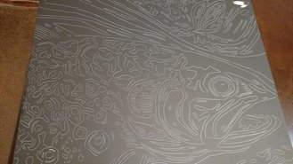 First step was to draw on the image I watched the scratch. Unlike pencil drawings, there is very little room for error in scratchboard (once scratched you can't go back). First step was to draw on the image I watched the scratch. Unlike pencil drawings, there is very little room for error in scratchboard (once scratched you can't go back). Thankfully, I enjoy telling stories. And, ultimately, I think that’s what scientific communication is about- telling the story of how the world works, including pieces of the plot that I think are still missing (i.e., my research), and convincing you that you also want me to solve that mystery. But, sometimes people don’t want to read the story. Sometimes they just want to flip through the pictures. Enter science art. 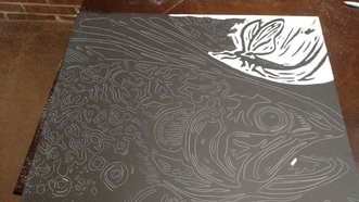 Once drawn in, it's time to scratch...and scratch...and scratch. The line scratched in is about the same thickness as a line drawn with a pencil. So, you just keep scratching to make big blocks of white. Once drawn in, it's time to scratch...and scratch...and scratch. The line scratched in is about the same thickness as a line drawn with a pencil. So, you just keep scratching to make big blocks of white. I started drawing some years ago while bored in a fish lab. It evolved into a little painting and, most recently, the scratchboard piece featured in this blog. The piece itself doesn’t tell much of a story. But, we don’t share long blocks of texts, graphs, or presentations over social media. We share images. And, if someone happens to see the image and clicks on my website, then it helps communicate my science and tell my story. The other story it tells it that our fearless leader is getting older! I don’t usually hang on to my artwork, and decided to give this piece to Ty for his birthday last week. Now I can haunt him forever! 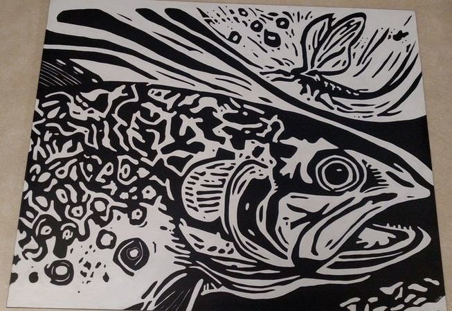 The finished product! I started working on this at the beginning of January and would put in about 5 hours a week until I finished it last week. I can count this as progress towards my dissertation, right?  X marks the spot, in this case where you can find stocked trout in Loyalsock Creek. X marks the spot, in this case where you can find stocked trout in Loyalsock Creek. We stock. We stock nonnative brown and rainbow trout in native brook trout streams, but we also stock brook trout in native brook trout streams. You may feel uneasy about nonnative stocking in native streams- there is clear evidence that brown and rainbow trout cause declines to native brook trout populations. But, what about stocking brook trout in brook trout streams? That seems pretty harmless, right? Or is it? You may have already heard about the negative genetic consequences that can occur if native brook trout spawn with stocked brook trout (otherwise known as introgression). In short, stocked fish are not genetically compatible with local stream conditions. If a native trout spawns with a hatchery fish, the offspring generally have lower survival, reduced growth, and go on to make fewer, less successful offspring. It’s a negative feedback and ultimately results in overall reduced population health that can take many generations to repair. But, hatchery and wild brook trout don’t always reproduce with one another, and even some evidence that there are very adults that are the product of hatchery and wild interbreeding (whether this is a choice or a failure for eggs to survive remains unclear). So, genetic consequences of stocking are sometimes quite minimal. In that case, the effects of stocking may depend more on how hatchery and wild brook trout interact with one another on a daily basis, otherwise known as conspecific (meaning same species) interactions. Following my post last week on the influence of stocking on ecosystem nutrients, I was sent a paper that discussed whether native or nonnative trout stocking is a bigger disruption to native ecosystems. The authors reviewed hundreds of research papers that documented the effects of stocking on everything from individuals, to populations, and on up to entire ecosystems. They found that native fish stocking can actually be WORSE on wild, native populations than nonnative stocking. How can it be so? How can more of a good thing (native fish) be a bad thing? It all makes sense in light of ecological theory which states that the more similar two individuals are, the more they will compete for resources. So, two toddlers are going to compete over the same toy more fiercely than a child and adult might. There is no doubt that brown and brook trout compete with one another- so much so that it causes declines in one species (usually brook trout). But, individual brook and brown trout compete less with one another than two brook trout compete with each other. Or, to put it another way, intraspecific (same species) competition is always higher than interspecific (between species) competition.  Stocked or not? It can be hard to tell because even stocked trout are gorgeous, but lack of color, rounded pectoral fins, and abnormal size are generally great signs a fish was stocked. Photo from kneedeepclub.org. Stocked or not? It can be hard to tell because even stocked trout are gorgeous, but lack of color, rounded pectoral fins, and abnormal size are generally great signs a fish was stocked. Photo from kneedeepclub.org. And, that’s where we have a problem. Competition between hatchery and wild trout of the same species can cause a shift in individual-level properties. Things like stress, physiology, growth, reproduction, movement, behavior…basically everything…are influenced by competition. And, because hatchery fish are often artificially selected to have higher growth, the competitive edge is given to them. Once hatchery fish outcompete wild fish, only the non-adaptive hatchery genes are left to sustain the population, which could speed up population collapse.
Of course, I’m not going to let nonnative stocked fish off the hook entirely. The authors showed that nonnative stocked fish have a significant negative effect on aquatic communities (which entails all living organisms in the stream, including frogs and other terrestrial species that only occasionally visit the water) and the ecosystem (which includes not only interactions with other organisms, but also nutrient processing and energy flow). Unfortunately, there aren’t many studies on how native stocked fish influence community and ecosystem-level processes, so we can’t be sure whether native or nonnative stocked fish have a greater impact at these levels of organization. So, once again, I warn you. Stocking has significant positive influences on angling opportunities, and is probably responsible for getting people off couches and into streams. But, the long-term consequences of stocking may be both negative and long-lasting, and in ways we still don’t entirely appreciate or understand. Note: Content in this post is my own and may not reflect the opinion of the manuscripts' authors or the agencies they represent. I encourage you to read the manuscript so you can contribute to the discussion. |
AuthorShannon White Archives
October 2018
Categories
All
|
The Troutlook
A brook trout Blog

 RSS Feed
Proudly powered by Weebly